2019 Most Trendy Furniture Colours Spring/ Summer
We finally got to embrace wonderful summer and it is a sign that a new year is about to begin soon.
Not long ago, New York Fashion Week just revealed Spring / Summer 2019 colour palette, and it’s not hard to find they share the common of being bold, passionated, energetic and very characteristic. If it can be wisely and creatively applied to internal furniture design, it could give the invigorative vibe on the first glance and it could be easy to say goodbye to boring ordinary living spaces.
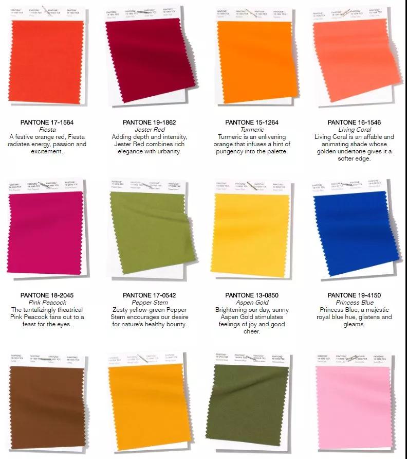
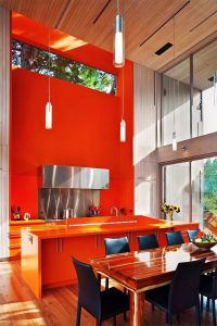
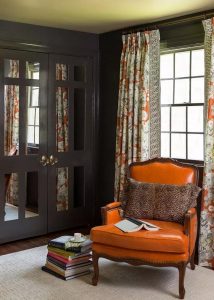
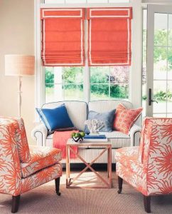
PANTONE 17-1564 – Fiesta
Fiesta Red is a colour of enthusiasm and joy, it is also a colour that gives the mindset of attractive and enchantment, definitely an irresistible colour. It is in fact an orangy red colour but much more lively and modern than orange.
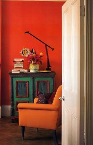
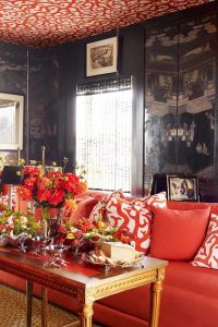
Either rendering it in large area or simply use this colour as decoration of centre piece would give you an exciting result.
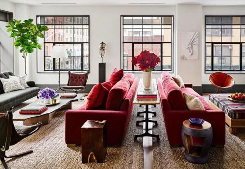
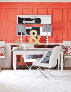
PANTONE 19-1862 – JESTER RED
Jester Red tend to dim down quite a bit, but it is much more elegant and prudent. It is beautiful but not garish at all and is a great colour for contemporary living spaces.
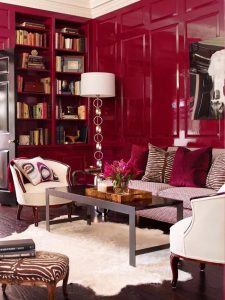
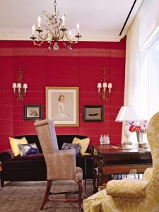
It is one of the top decorative colour for furniture, it instantly shows the charm when being combined with neutral background.
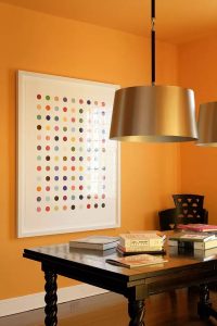
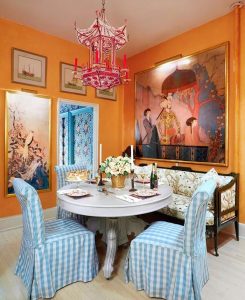
PANTONE 15-1264 – Turmeric
Surely a colour full of strong character, instantly perks up a living space. It is created to be naturally energetic, ‘spicy’ but can be a modern choice when used as living room furniture.
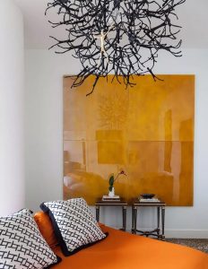
Its warm tone allows it to be a brilliant choice of a decor or a part of background. Best application would be to use it on the leading piece of furniture in a certain room, it would give you a bright mood just like its colour.
PANTONE 16-1546 – Living Coral
Living Coral is a soothing gentle colour while enabling the space to be young and lively. Great to use in girls room for its warm and dreamy characteristics.
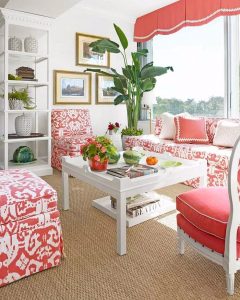
It would 100% perfectly matches to white or cream colour – lovable and comfortable combination.
Add a hint of blue and it would turn out to be fun and playful! One of my favourite combination!
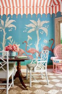
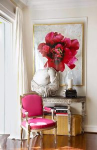
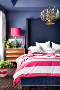
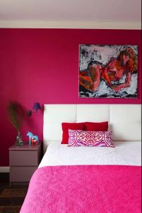
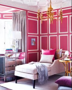
PANTONE 18-2045 – Pink Peacock
Pink Peacock is similar to the common rose pink but it is more showy and eye-catching. A bit flaunty and full of glamour when fusing it with white, gold or navy.
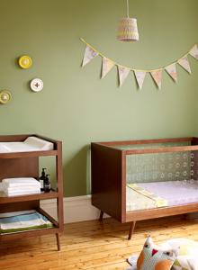
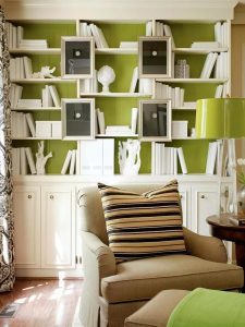
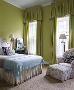
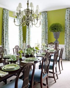
PANTONE 17-0542 – PEPPER STEM
Refreshing colour of nature, Pepper Stem combines both green and yellow characters to result in vigorous vibe. Suitable to render in large area as a colour of wallpaper, curtains, bedding and sofa to create your own country style.